
 #NO.1 Responsive Websites Company In Noida


Planning and Strategy
Our web developers work with planning and strategies to maintain perfect correctness for your website so your website builds the right content. And build a target audience for you.

Design
Web designers work on the visual elements of the website, including layout, color schemes, typography, and graphics. User experience (UX) and user interface (UI) design principles are applied to ensure the website.

Content Creation
We create blog posts for your website infographics so your websites can meet the target audiences. Which will allow you to maintain an informative website too. Videos and informative content that will lead you to enhance your web design.
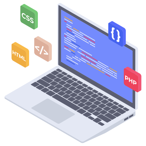
Development
The method of building and upholding the design of the website which includes, coding, and designing, in the front end (HTML, CCS, JavaScript), backend (PHP, Ruby, Python, and Java)

Testing
Our experts run an analysis test to ensure that the website works properly in browsers and other devices. We also make sure if it needs final editing or improvement at the last minute.

Launch
After going through all our client's requirements and our expert's testing and optimizations, your website is ready to go live. Which includes DNS configurations to make the website go public.